・お題:先日インストールしたパッケージ群tidyverseに、ggplot2というグラフを作成するパッケージが入っていた。ggplot2でいろいろ作図してみたい。
・以下のサイトを参考にさせて頂いた。非常に丁寧に解説なさっているので、ぜひそちらをご参照いただきたい。
・サイトの紹介だけでは身につかないので、実際に手を動かしてグラフを作成してみる。せっかくなので、データセットを変えてみたい。以下のサイトを参考に、「餌別のヒナの齢に対する体重」ChickWeightを使ってみる。
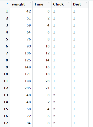
・データを眺めてみると、Chickにひよこ番号、Dietに餌の種類、Timeに体重測定の日、weightに体重が入っているっぽい。weightとTimeは数字、ChickとDietはfactorっぽい。ひよこは50羽、餌の種類は4種類あるみたい。
> library(tidyverse)
> View(ChickWeight)
> str(ChickWeight)
Classes ‘nfnGroupedData’, ‘nfGroupedData’, ‘groupedData’ and 'data.frame': 578 obs. of 4 variables:
$ weight: num 42 51 59 64 76 93 106 125 149 171 ...
$ Time : num 0 2 4 6 8 10 12 14 16 18 ...
$ Chick : Ord.factor w/ 50 levels "18"<"16"<"15"<..: 15 15 15 15 15 15 15 15 15 15 ...
$ Diet : Factor w/ 4 levels "1","2","3","4": 1 1 1 1 1 1 1 1 1 1 ...
・とりあえず、1番の餌を与えられたひよこを抽出する。
> data1<-filter(ChickWeight,Diet=="1")
・順を追って作図していく。
・とりあえず、キャンバスを作成。
>ggplot(data = data1)#キャンバス準備

・軸をマッピング。
> ggplot(data = data1) +
aes(x = Time, y = weight)#横軸Time、縦軸weightとしてマッピング。

・散布図をプロット。
> ggplot(data = data1) +
aes(x = Time, y = weight) +
geom_point()#散布図をプロット

・散布図に色を付ける。
> ggplot(data = data1) +
aes(x = Time, y = weight) +
geom_point(mapping = aes(color = Chick), alpha = 0.6)#geom_***の中に色などの工夫を入れられる。

・ベーステーマを変更。
> ggplot(data = data1) +
aes(x = Time, y = weight) +
geom_point(mapping = aes(color = Chick), alpha = 0.6)+
theme_classic()#ベーステーマを変えてみる。

・凡例の順番を変更。
> ggplot(data = data1) +
aes(x = Time, y = weight) +
geom_point(mapping = aes(color = Chick), alpha = 0.6)+
guides(color = guide_legend(reverse = TRUE))+#凡例の順番を逆にする。
theme_classic()

・タイトルと軸を変更。
> ggplot(data = data1) +
aes(x = Time, y = weight) +
geom_point(mapping = aes(color = Chick), alpha = 0.6)+
guides(color = guide_legend(reverse = TRUE))+
labs(title = "えさ1",
x = "測定日",
y = "体重(g)")+
theme_classic()

・箱ひげ図を描いてみる。
> ggplot(data = data1) +
aes(x = Time, y = weight) +
geom_boxplot(mapping = aes(group = Time))+
theme_classic()

・餌の種類ごとに箱ひげ図を描いてみる。
> ggplot(data = ChickWeight) +
aes(x = Time, y = weight) +
geom_boxplot(mapping = aes(group = Time, fill = Diet))+#fillで色をDietで指定。
facet_wrap(~Diet) +#Dietごとにグラフを作成。チルダが必要っぽい。
theme_classic()

・色のセットを変えたい。以下のサイトを参考に設定した。
・まずはカラーパレットの確認。
> RColorBrewer::display.brewer.all()

・Accentのカラーセットを使って作図。
>ggplot(data = ChickWeight) +
aes(x = Time, y = weight, fill = Diet) +
geom_boxplot(mapping = aes(group = Time))+
facet_wrap(~Diet) +
scale_fill_brewer(palette = "Accent")+
theme_classic()

・最後に、グラフをオブジェクトにして保存してみる。先のggplotの前にgg<-を付けてggというオブジェクトに格納(割愛)。
> ggsave(plot = gg, filename = "test01.pdf", device = "pdf")
Saving 7 x 7 in image
おわり。