・お題:Rでグラフを描くライブラリとして代表的なものに、ggplot2というのがある。先日使いそうなやつを纏めたけれど、一番使いそうな棒グラフが抜けていた。今回は棒グラフで私が使いそうなやつの例を纏めたい。
・ライブラリを読み込む。tidyverseにggplot2が含まれているので、tidyverseを読み込む。
> library(tidyverse)
・適当なデータセットを作成する。
> set.seed(1)
> Group <- rep(c("A", "B", "C", "D"), each = 8)
> Score <- c(rnorm(8, mean = 10, sd = 2),
+ rnorm(8, mean = 12, sd = 2),
+ rnorm(8, mean = 14, sd = 2),
+ rnorm(8, mean = 16, sd = 2))
> df <- data.frame(Group, Score)
> df %>% head()

> df %>% str(.)
'data.frame': 32 obs. of 2 variables:
$ Group: chr "A" "A" "A" "A" ...
$ Score: num 8.75 10.37 8.33 13.19 10.66 ...
・次に、データを読み込む。
> p <- ggplot(data = df)
・デフォルトだとY軸のゼロより下のところにスペースが入るのだけれど、個人的にあまり好きではないので、それを消すために以下のサイトを参考にさせて頂いた。
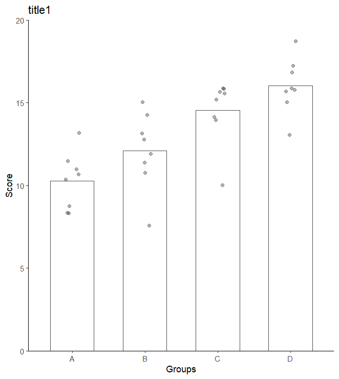
・棒グラフを描く。まず、私が最もよく使う、平均値+個別値のプロット。
> bar1 <- p +
+ geom_bar(aes(x = as.factor(Group), #X軸
+ y = Score), #Y軸
+ stat = "summary", #統計量を算出
+ fun = "mean", #平均値で棒グラフを描く。
+ fill = "white", #棒の中の色
+ color = "gray30", #棒の淵の色
+ width = 0.6) + #棒の幅
+ geom_jitter(mapping = aes(x = as.factor(Group),
+ y = Score), #個別値プロット
+ alpha = 0.3, #透明度
+ width = 0.1) + #散らかり具合の幅
+ scale_y_continuous(expand = c(0, 0), limits = c(0, 20)) + #Y軸ゼロ下のスペースを潰す
+ labs(title="title1",
+ x = "Groups",
+ y = "Score")+
+ theme_classic()
> plot(bar1)
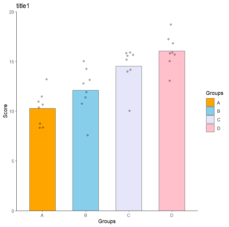
・次に、色を変えてみる。今回はグループごとに色を変えたが、色の指定をうまくすれば、特定のバーだけ色を変えることもできる。
> bar2 <- p +
+ geom_bar(aes(x = as.factor(Group),
+ y = Score,
+ fill = as.factor(Group)), #色を指定
+ stat = "summary",
+ fun = "mean",
+ color = "gray30",
+ width = 0.6) +
+ scale_fill_manual(name = "Groups", labels = c("A", "B", "C", "D"), values = c("orange", "skyblue", "lavender", "pink")) +
+ geom_jitter(mapping = aes(x = as.factor(Group),
+ y = Score),
+ alpha = 0.3,
+ width = 0.1) +
+ scale_y_continuous(expand = c(0, 0), limits = c(0, 20)) +
+ labs(title="title1",
+ x = "Groups",
+ y = "Score")+
+ theme_classic()
> plot(bar2)
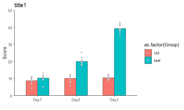
・次に、もうちょっとこみいったグラフを作成する。
・データセットを作成する。
> Group <- rep(c("ctrl", "test"), each = 30)
> Days <- rep(c("Day1", "Day2", "Day3"), each = 10) %>%
+ rep(., times = 2)
> Score <- c(rnorm(30, mean = 10, sd = 2),
+ rnorm(10, mean = 10, sd = 2),
+ rnorm(10, mean = 20, sd = 2),
+ rnorm(10, mean = 40, sd = 2))
> df2 <- data.frame(Group, Days, Score) %>%
+ group_by(Group, Days) #グループ化しておく
> df2 %>% head()

・データを読み込む。
> p2 <- ggplot(data = df2)
・グラフを描く。
> bar3 <- p2 +
+ geom_bar(mapping = aes(x = as.factor(Days),
+ y = Score,
+ fill = as.factor(Group)),
+ position="dodge",
+ stat = "summary",
+ fun = "mean",
+ color = "gray30",
+ width = 0.6)+
+ geom_point(mapping = aes(x = as.factor(Days),
+ y = Score,
+ fill = as.factor(Group)),
+ position = position_dodge(0.6),
+ color = "gray") +
+ scale_y_continuous(expand = c(0, 0), limits = c(0, 50)) +
+ labs(title="title1",
+ x = "",
+ y = "Score")+
+ theme_classic()
> plot(bar3)
・ちなみに、facet機能を使うとグラフを分離できる。
> bar3.5 <- bar3+
+ facet_grid(. ~ as.factor(Group))
> plot(bar3.5)

> bar3.6 <- bar3+
+ facet_grid(as.factor(Group) ~ .)
> plot(bar3.6)

・個別のプロットをそれぞれのGroupに対応させるやり方が良く分からなかったので、以下を参考にさせて頂いた。
・先のサイトを参考に、エラーバーで図示してみる。まず統計量を算出。
> df3 <- df2 %>% summarise_at(vars(Score), list(mean = ~mean(.),
+ sd = ~sd(.),
+ se = ~sd(.)/sqrt(length(.))))
> df3

・データを読み込む。この時点でmappingを指定しないとgeom_errorbarがうまく機能しなかった。。
> p3 <- ggplot(data = df3,
+ mapping = aes(x = as.factor(Days),
+ y = mean,
+ fill = as.factor(Group)))
・棒グラフを描く。
> bar4 <- p3 +
+ geom_bar(position="dodge",
+ stat = "identity",
+ color = "gray30",
+ width = 0.6)+
+ geom_errorbar(mapping = aes(ymin = mean - se,
+ ymax = mean + se),
+ position = position_dodge(0.6),
+ width = 0.1)+
+ scale_fill_manual(name = "Groups", labels = c("ctrl", "test"), values = c("white", "black")) + #個別の色を設定
+ scale_y_continuous(expand = c(0, 0), limits = c(0, 50)) +
+ labs(title="title1",
+ x = "",
+ y = "Score")+
+ theme_classic()
> plot(bar4)
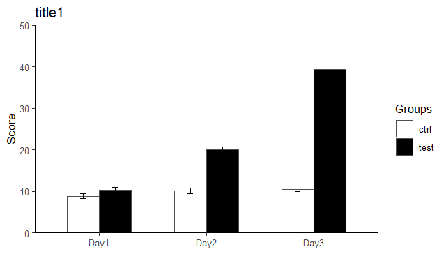
・なんだか見覚えのあるグラフになった。
おわり